Colour Palette
The following colours are the only ones that should appear on the Liberal Party of Canada website.
| |
Main Red
#d71920 |
|
Main Grey
#58595b |
| |
Dark Red 1
#b11116 |
|
Light Grey 1
#808286 |
| |
Dark Red 2
#8b0304 |
|
Light Grey 2
#a7a9ac |
| |
Dark Red 3
#670000 |
|
Light Grey 3
#d1d3d4 |
| |
Dark Red 4
#3c0000 |
|
Light Grey 4
#f1f2f2 |
| |
Light Blue
#0babe3 |
|
Green
#6ebf52 |
| |
Dark Blue
#3d4f5d |
|
Yellow
#f9b717 |
Typography
Headlines
The header tags not only confer special styling on these elements, they aid in SEO and are essential for accessibility. The cascading headers should be used as needed. <h1></h1> tags should be used for the title of the page, or major sections in a document. <h2></h2> for top-level sub headings and so on. In general, you shouldn’t add extra styling on headlines unless using one of the specified classes.
<h1>H1 - Primary Headline</h1>

    <h2>H2 - Headline 2</h2>

    <h3>H3 - Headline 3</h3>

    <h4>H4 - Headline 4</h4>

    <h5>H5 - Headline 5</h5>
H1 – Primary Headline
H2 – Headline 2
H3 – Headline 3
H4 – Headline 4
H5 – Headline 5
Paragraphs
There are two standard types of paragraphs for body text, the lead paragraph and the normal paragraph. WordPress automatically adds paragraph tags, <p></p> around loose (untagged) text in the editor, so you don’t need to worry about specifically assigning those.
<p class="lead">Lead Paragraph...</p>

      <p>Regular Paragraph...</p>
Lead Paragraph… Lorem ipsum dolor sit amet, consectetur adipiscing elit.
Regular Paragraph… Donec leo lorem, aliquam in finibus et, varius a ipsum. Praesent semper ex accumsan lacus auctor ultrices.
Helper Classes
There are also several helper classes that can be added to headlines and paragraphs by adding class="className" within the opening headline tag, e.g. <h3 class="className">. You can add two classes with a space, like this <p class="className1 className2">
<h3 class="darkgrey-text">Dark Grey Headline</h3>

    <p class="grey-text">Light Grey paragraph</p>

    <h4 class="liberal-font">Liberal font</h4>

    <h5 class="darkgrey-text liberal-font">Liberal font</h5>
Dark Text Headline 3
Light grey paragraph. Duis pharetra euismod nunc vel interdum. Nulla facilisi.
Liberal font Headline 4
Dark grey headline 5 in liberal font
Special Classes
There are also several special paragraph styles that can be used for specific instances. These may be helpful for both blog posts or pages.
Text-alignment classes
Text-alignment classes can be added to the majority of html tags, which aligns the text within that element, including right, left (default), center and justified.
<h3 class="text-center">Centered Headline</h3>

    <p class="text-right">[Paragraph Text]</p>

    <p class="text-justify">[Paragraph Text]</p>
Centered Headline
Lorem ipsum dolor sit amet, consectetur adipiscing elit. Donec leo lorem, aliquam in finibus et, varius a ipsum.
Nam viverra ornare lacus, et luctus dui ornare sit amet. Morbi semper, urna a fringilla scelerisque, purus lacus dapibus urna, praesent semper ex accumsan lacus auctor ultrices. Duis pharetra euismod nunc vel interdum. Nulla facilisi.
Dramatic Quotes
To produce a dramatic quote effect, wrap the quote in paragraph tags with the class “quote,” <p class="quote"></p>. There are two additional options that can be added, for both the speaker and their accreditation, using nestled span tags within the paragraph tags. This paragraph class is often used with the helper class text-center.
<p class="quote text-center">"Lorem ipsum dolor sit amet, consectetur adipiscing elit. Donec leo lorem, aliquam in finibus et, varius a ipsum."

 <span>Justin Trudeau

  <span>Leader, Liberal Party of Canada</span>

 </span>

</p>
“Lorem ipsum dolor sit amet, consectetur adipiscing elit. Donec leo lorem, aliquam in finibus et, varius a ipsum.”Justin TrudeauLeader, Liberal Party of Canada
Blockquotes
Blockquotes are a special type of paragraph tag that are meant to be used within the body of page text to bring attention to a paragraph of text. Text in blockquotes should not appear elsewhere in the story or page (unlike pullquotes, below).
<p>Lorem ipsum dolor sit amet, consectetur adipiscing elit. Donec leo lorem, aliquam in finibus et, varius a ipsum. Praesent semper ex accumsan lacus auctor ultrices. Duis pharetra euismod nunc vel interdum.</p>

<blockquote>Nulla facilisi. Nam viverra ornare lacus, et luctus dui ornare sit amet.</blockquote>

<p>Morbi semper, urna a fringilla scelerisque, purus lacus dapibus urna, sed suscipit ipsum neque elementum nibh. Mauris ut diam nisl.</p>
Lorem ipsum dolor sit amet, consectetur adipiscing elit. Donec leo lorem, aliquam in finibus et, varius a ipsum. Praesent semper ex accumsan lacus auctor ultrices. Duis pharetra euismod nunc vel interdum.
Nulla facilisi. Nam viverra ornare lacus, et luctus dui ornare sit amet.
Morbi semper, urna a fringilla scelerisque, purus lacus dapibus urna, sed suscipit ipsum neque elementum nibh. Mauris ut diam nisl.
Pullquotes
Pullquotes are called using a paragraph class and should be used to reinforce a particular quote or line from the story or page. These, unlike blockquotes, should also appear elsewhere, usually further down, in the natural flow of the article.
<p class="pullquote">Nulla facilisi. Nam viverra ornare lacus, et luctus dui ornare sit amet.</p><p>Lorem ipsum dolor sit amet, consectetur adipiscing elit. Donec leo lorem, aliquam in finibus et, varius a ipsum. Praesent semper ex accumsan lacus auctor ultrices. Duis pharetra euismod nunc vel interdum. Nulla facilisi. Nam viverra ornare lacus, et luctus dui ornare sit amet. Morbi semper, urna a fringilla scelerisque, purus lacus dapibus urna, sed suscipit ipsum neque elementum nibh. Mauris ut diam nisl. Donec varius nunc sed aliquet posuere. Curabitur malesuada ac purus nec tristique. Nulla imperdiet efficitur tellus, tempus tincidunt dolor placerat vitae.</p>
Nulla facilisi. Nam viverra ornare lacus, et luctus dui ornare sit amet.
Lorem ipsum dolor sit amet, consectetur adipiscing elit. Donec leo lorem, aliquam in finibus et, varius a ipsum. Praesent semper ex accumsan lacus auctor ultrices. Duis pharetra euismod nunc vel interdum. Nulla facilisi. Nam viverra ornare lacus, et luctus dui ornare sit amet. Morbi semper, urna a fringilla scelerisque, purus lacus dapibus urna, sed suscipit ipsum neque elementum nibh. Mauris ut diam nisl. Donec varius nunc sed aliquet posuere. Curabitur malesuada ac purus nec tristique. Nulla imperdiet efficitur tellus, tempus tincidunt dolor placerat vitae.
Links
Links are created using the <a> tag. The target of the link is defined by the href="". The open and close tags wrap the desired hyperlink text, <a href="">Link Text</a>. Call-to-action buttons can be called by adding additional classes to the <a> tag (see below).
<a href="http://www.liberal.ca">Visit Liberal.ca</a>

<a class="flashy-button" href="http://www.liberal.ca">Visit Liberal.ca</a>

<a class="flashy-button large" href="http://www.liberal.ca">Visit Liberal.ca</a>

<a class="flashy-button down large" href="http://www.liberal.ca">Download</a>
Thumbnail Images
Images can be floated within the body of text, either to the right or left, using the following classes.
Note that when first inserting an image from the WordPress Media Library, there are a lot of the code that can be removed. It can be made as simple as the examples below:
<img src="/files/2014/11/liberal-avatar-02.jpg" alt="Example Image" class="th right" /><p class="text-justify">Lorem ipsum dolor sit amet, consectetur adipiscing elit. Donec leo lorem, aliquam in finibus et, varius a ipsum. Praesent semper ex accumsan lacus auctor ultrices. Duis pharetra euismod nunc vel interdum. Nulla facilisi. Nam viverra ornare lacus, et luctus dui ornare sit amet. Morbi semper, urna a fringilla scelerisque, purus lacus dapibus urna, sed suscipit ipsum neque elementum nibh. Mauris ut diam nisl. <img src="/files/2014/11/liberal-avatar-02.jpg" alt="Example Image" class="th left" />Donec varius nunc sed aliquet posuere. Curabitur malesuada ac purus nec tristique. Nulla imperdiet efficitur tellus, tempus tincidunt dolor placerat vitae. Lorem ipsum dolor sit amet, consectetur adipiscing elit. Quisque odio magna, suscipit sed iaculis eu, dapibus eget mauris.</p>

Lorem ipsum dolor sit amet, consectetur adipiscing elit. Donec leo lorem, aliquam in finibus et, varius a ipsum. Praesent semper ex accumsan lacus auctor ultrices. Duis pharetra euismod nunc vel interdum. Nulla facilisi. Nam viverra ornare lacus, et luctus dui ornare sit amet. Morbi semper, urna a fringilla scelerisque, purus lacus dapibus urna, sed suscipit ipsum neque elementum nibh. Mauris ut diam nisl. Donec varius nunc sed aliquet posuere. Curabitur malesuada ac purus nec tristique. Nulla imperdiet efficitur tellus, tempus tincidunt dolor placerat vitae. Lorem ipsum dolor sit amet, consectetur adipiscing elit. Quisque odio magna, suscipit sed iaculis eu, dapibus eget mauris.
Videos
Videos embed codes from Youtube should always be wrapped in a <div> tag with a videoWrapper class to make the video full-width and responsive. The Youtube embed code can be found under the share link below the video.
<div class="videoWrapper"><iframe width="853" height="480" src="//www.youtube.com/embed/Vmw7fvG5Ov4" frameborder="0" allowfullscreen></iframe></div>
Tables & Lists
There are several types of tables and lists that can be used. They are summarized by example below.
Normal Tables
<table>

 <tr>

  <th>Header</th>

  <th>Header</th>

 </tr>

 <tr>

  <td>Contents</td>

  <td>Contents</td>

 </tr>

 <tr>

  <td>Contents</td>

  <td>Contents</td>

 </tr>

</table>
| Header |
Header |
| Contents |
Contents |
| Contents |
Contents |
Pricing Tables
Although it looks like a table, it actually an unordered list!
<ul class="pricing-table">

 <li class="title">Laurier Club</li>

 <li class="price"><img src=".../laurier-club-icon.png"></li>

 <li class="title light">Download options</li>

 <li class="bullet-item">Red EPS</li>

 <li class="bullet-item">Red PNG</li>

</ul>
- Laurier Club

- Download options
- Red EPS
- Red PNG
Other Unordered Lists
Although it looks like a table, it actually an unordered list!
Normal List

<ul>

 <li>Normal list item</li>

 <li>Normal list item</li>

</ul>
Checklist

<ul class="checklist">

 <li class="check">Checked list item</li>

 <li class="x">X list item</li>

</ul>
Normal List
- Normal list item
- Normal list item
Checklist
- Checked list item
- X list item
Page Structure
Grid System
The Liberal Party of Canada website is built on a “grid” foundation, which means that there are easy to use HTML tags that can add structure, in the form of columns, to a basic page. It’s how the sidebar is positioned on this page, and how the HTML code and Rendered HTML cards are positioned beside each other.
The basics are presented below, but for more details, check out the Foundation doc on the topic.
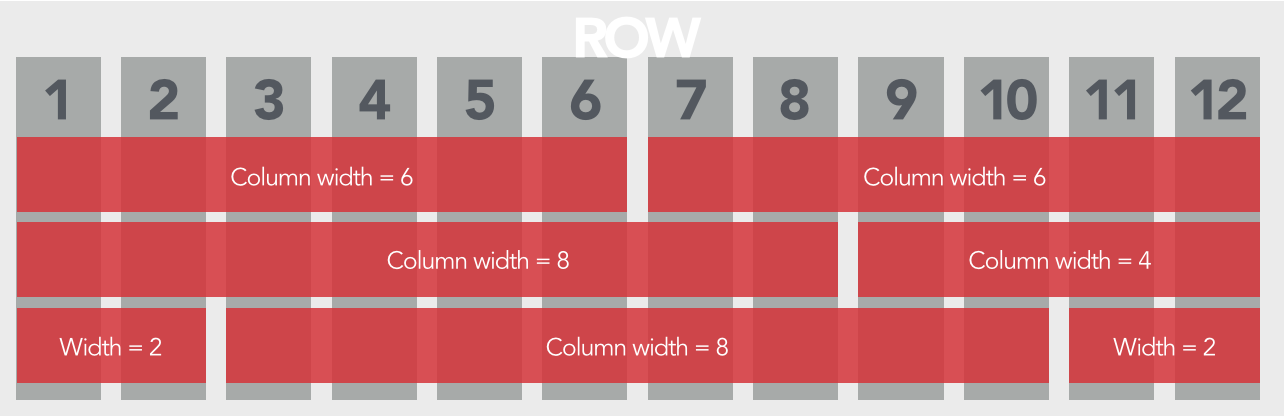
The grid is 12 across and can be used to split page contents into columns of various size:
This grid is also responsive, and each of the grid columns shrinks as the window shrinks. Also, at certain “breakpoints” these columns instead become stacked rows.
Window larger than breakpoint:
Window smaller than breakpoint:
The breakpoints are dubbed small, medium and large, and loosely correspond to mobile phone, tablet and monitor, respectively. These are used when calling the columns themselves via HTML. Two small-6 columns will each maintain a width of half the page, no matter the window size. Alternatively, large-6 columns will each maintain a width of 50% until the large breakpoint is reached, below which they will become two full-width rows instead.
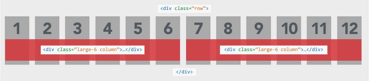
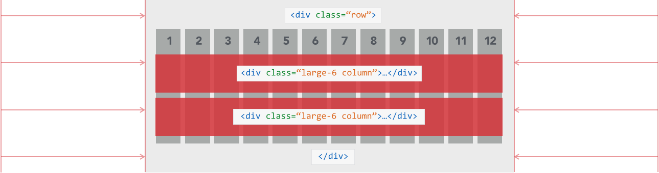
Below is the required HTML to introduce a row of columns into a page or post. Resize the window to see the difference between the large, medium and small columns.
<div class="row">

 <div class="large-6 column">...</div>

 <div class="large-6 column">...</div>

</div>

<div class="row">

 <div class="medium-8 column">...</div>

 <div class="medium-4 column">...</div>

</div>

<div class="row">

 <div class="small-2 columns">...</div>

 <div class="small-8 columns">...</div>

 <div class="small-2 columns">...</div>

</div>